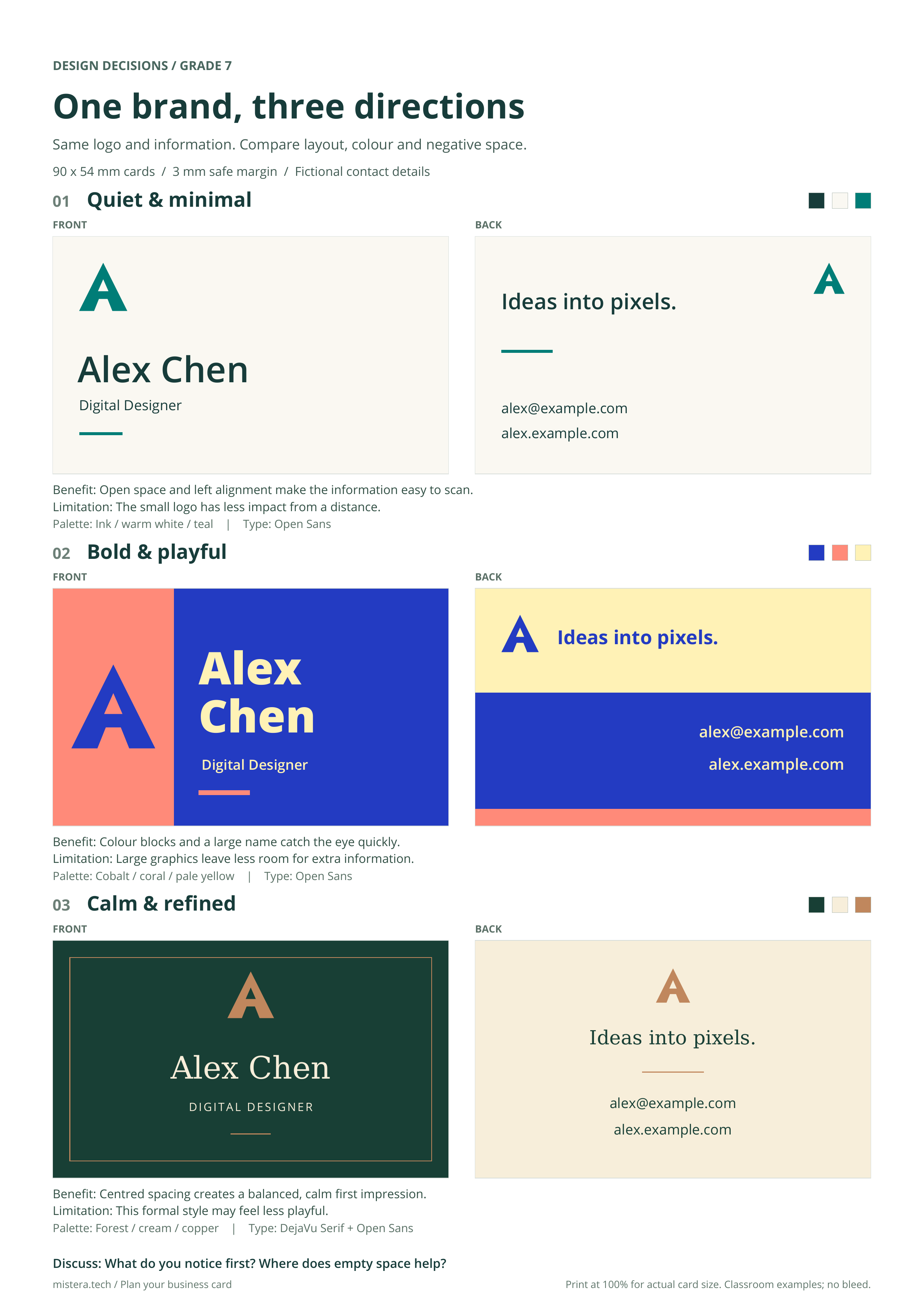
For diagrams, visual examples and the full layout, open the handout above.
BUSINESS CARD DESIGN
GRADE 7 DESIGN • PERSONAL BRAND • APPLICATION 01
MISSION: Prove that your brand works on a real object — not just as a logo.
IF YOUR FINAL LOGO / MINI BRAND GUIDE IS NOT FINISHED: finish that first.
| 1 | GET YOUR BRAND ASSETS READY |
| FINAL LOGO | □ ready |
| 3 BRAND WORDS | ____________________________ |
| 2–3 BRAND COLORS | ____________________________ |
| 1–2 TYPEFACES | ____________________________ |
| 2 | WHAT DOES A BUSINESS CARD NEED? |
Your card is small. Every item must earn its space.
| MUST HAVE
Name | MUST HAVE
Logo / brand mark | SHOULD HAVE
Role / short identity |
| OPTIONAL
Class-safe email / website | OPTIONAL
Short tagline | DO NOT USE
Home address / personal phone |
CLASS SIZE: 90 mm × 54 mm, front + back.
| 3 | LOOK AT REAL CARDS — QUICKLY |
Find 2–3 real business card designs online. Spend no more than 5 minutes.
| CARD | WHAT WORKS? | WHAT WOULD YOU AVOID? |
| Example 1
________________________________________________________________________
________________________________________________________________________ |
________________________________________________________________________
________________________________________________________________________ |
________________________________________________________________________
________________________________________________________________________ |
| Example 2
________________________________________________________________________
________________________________________________________________________ |
________________________________________________________________________
________________________________________________________________________ |
________________________________________________________________________
________________________________________________________________________ |
Do NOT spend time decorating. Test three different arrangements.
| LAYOUT 1FRONTBACK | LAYOUT 2FRONTBACK | LAYOUT 3FRONTBACK |
| Circle the strongest layout. Why is it the best fit for your brand?
________________________________________________________________________
________________________________________________________________________ |
Use your EXISTING brand system. Do not invent a new style for the card.
| FRONT
□ logo / mark
□ name
□ clear focal point | BACK
□ role / identity
□ safe contact / website if used
□ supporting brand elements |
CHECK WHILE BUILDING:
□ Logo has room to breathe
□ Name is easy to find
□ Text is readable
□ Colors match the brand guide
□ Fonts match the brand guide
□ Front and back feel like ONE system
A business card is SMALL. Zoom out / print / resize until it is close to real size.
| Can you read the NAME quickly? □ YES □ NO
________________________________________________________________________ |
| Can you recognize the LOGO quickly? □ YES □ NO
________________________________________________________________________ |
| What becomes too small / crowded?
________________________________________________________________________
________________________________________________________________________ |
| What do you notice FIRST?
________________________________________________________________________ |
| Does this feel like the same brand as the logo / brand guide?
________________________________________________________________________ |
| What is hardest to read?
________________________________________________________________________ |
| What should be removed or simplified?
________________________________________________________________________ |
| The ONE change I made after testing was…
________________________________________________________________________
________________________________________________________________________ |
| I changed it because…
________________________________________________________________________
________________________________________________________________________ |
□ Editable file saved
□ Front exported
□ Back exported